
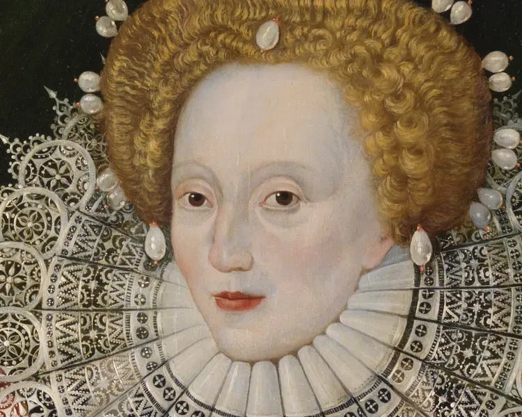
Royal Museums Greenwich is home to the National Maritime Museum, Royal Observatory Greenwich, historic ship Cutty Sark and the Queen's House.
The museum collections include over 2.5 million items and offer a window into maritime life, scientific enquiry and artistic achievement.
Browse online articles, hear from museum curators, astronomers and special guests, and take a deep dive into our collections and archives.
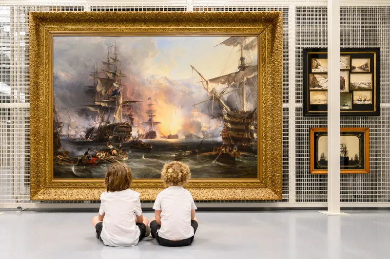
Explore by theme

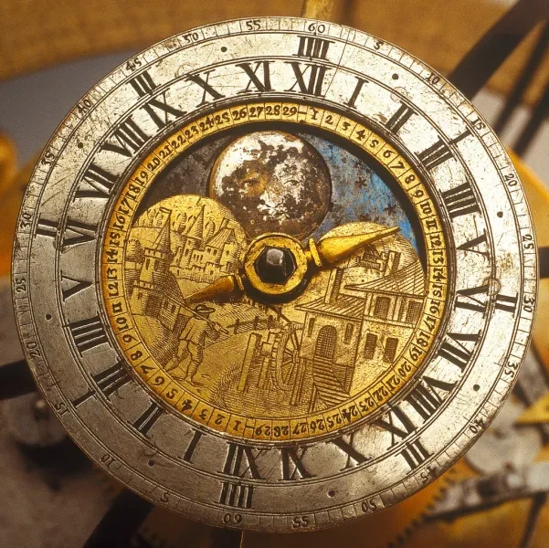

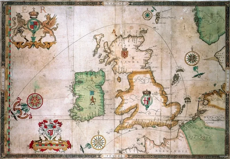
A history of the Royal Observatory in six objects
Explore 350 years of the world-renowned institution and the people who worked there through six intriguing objects
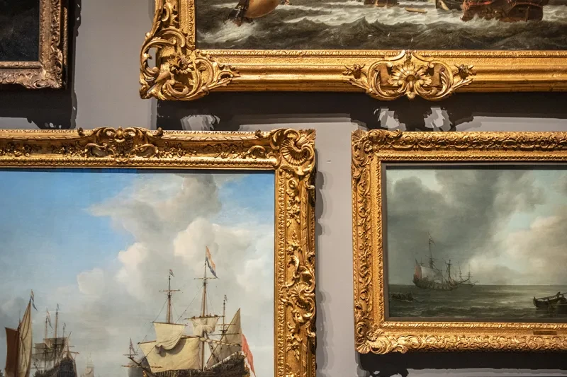
Search the collection
Explore our digital collections or visit our library, archive and collections studio in person
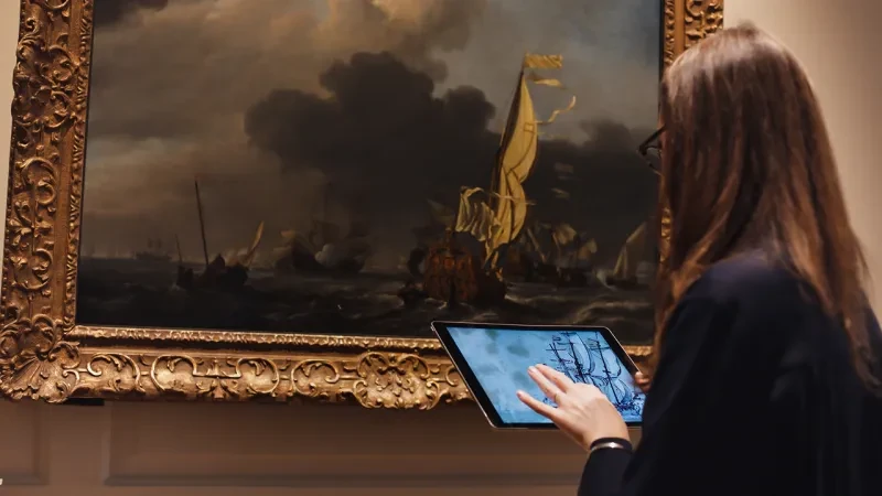
Collections Online
Search our online database and explore our objects, paintings, archives and library collections from home
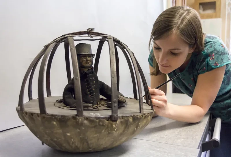
The Prince Philip Maritime Collections Centre
Come behind the scenes at our state-of-the-art conservation studio
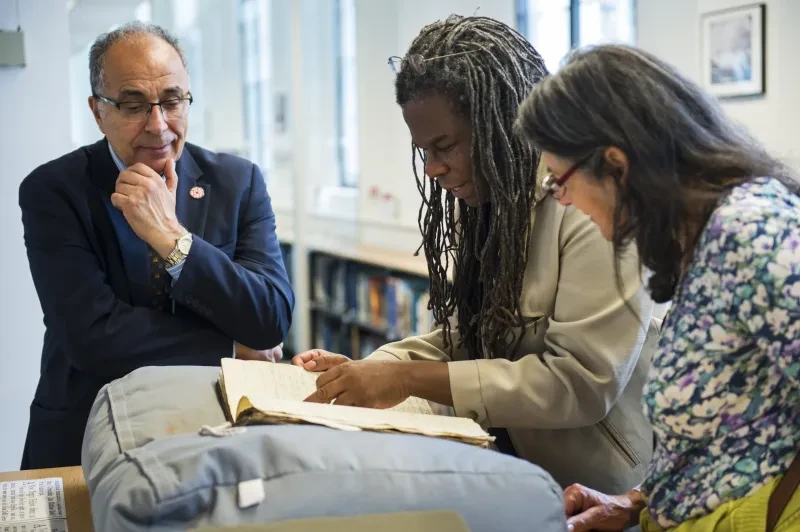
Caird Library
Visit the world's largest maritime library and archive collection at the National Maritime Museum
Research
Find out about our current research projects, opportunities and conferences, and meet the curatorial team at Royal Museums Greenwich
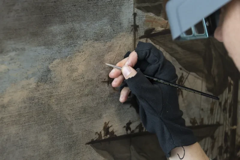
Conservation
The Conservation and Preservation team maintain and look after our collections
Museum blog
Go behind the scenes with our expert curators, astronomers, conservators and library & archive team

Support stories like these
Royal Museums Greenwich is a charity, and we rely on your support to care for our collections and allow everyone to discover the wonders of space, time, history and creativity. Donate today and help shape the Museum's future.