

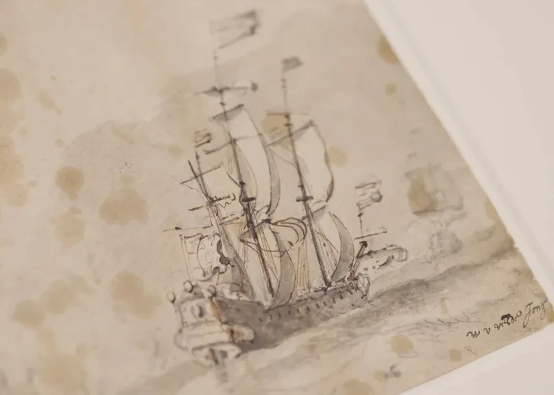
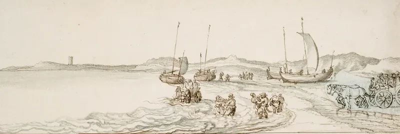
"To be noted: a ship or small vessel in pitching nearly always throws up spray, as shown here.”
This line, written in Dutch above a rapidly drawn sketch of boats in a heavy sea, is one of dozens of notes, annotations, instructions and inscriptions found on Van de Velde drawings held at Royal Museums Greenwich.
Once deciphered, the messages are instantly intriguing. Who were they written for, and what can they tell us about the Van de Veldes' artistic approach?
"These drawings are so fascinating, because it’s like having a tutorial from the Van de Veldes themselves, passed down through the centuries,” suggests Dr Allison Goudie, Curator of Art at Royal Museums Greenwich.

Studies of a ship and of a boat pitching and sending
PAF6667 • Prints & Drawings
This study is one of a number of Van de Velde drawings apparently made to instruct others in the art of seascapes.
The drawing includes examples of different sized ships and boats pitching in heavy seas, with the explanation about the pattern of spray written along the top.
How to create a seascape
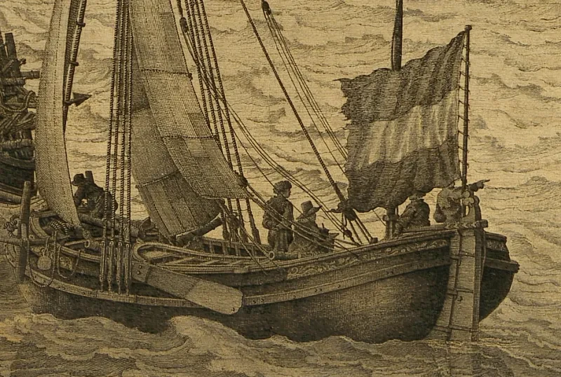
The pen and ink drawing below includes three different sketches depicting a ship’s guns being fired. Written alongside are the words, ‘ick heb genoteert wanner met stiel Weder, d kannon schoete gedaen wierde, ofte met windigh Weder men groete notissie moet neme als hier boven aen gewesse’.
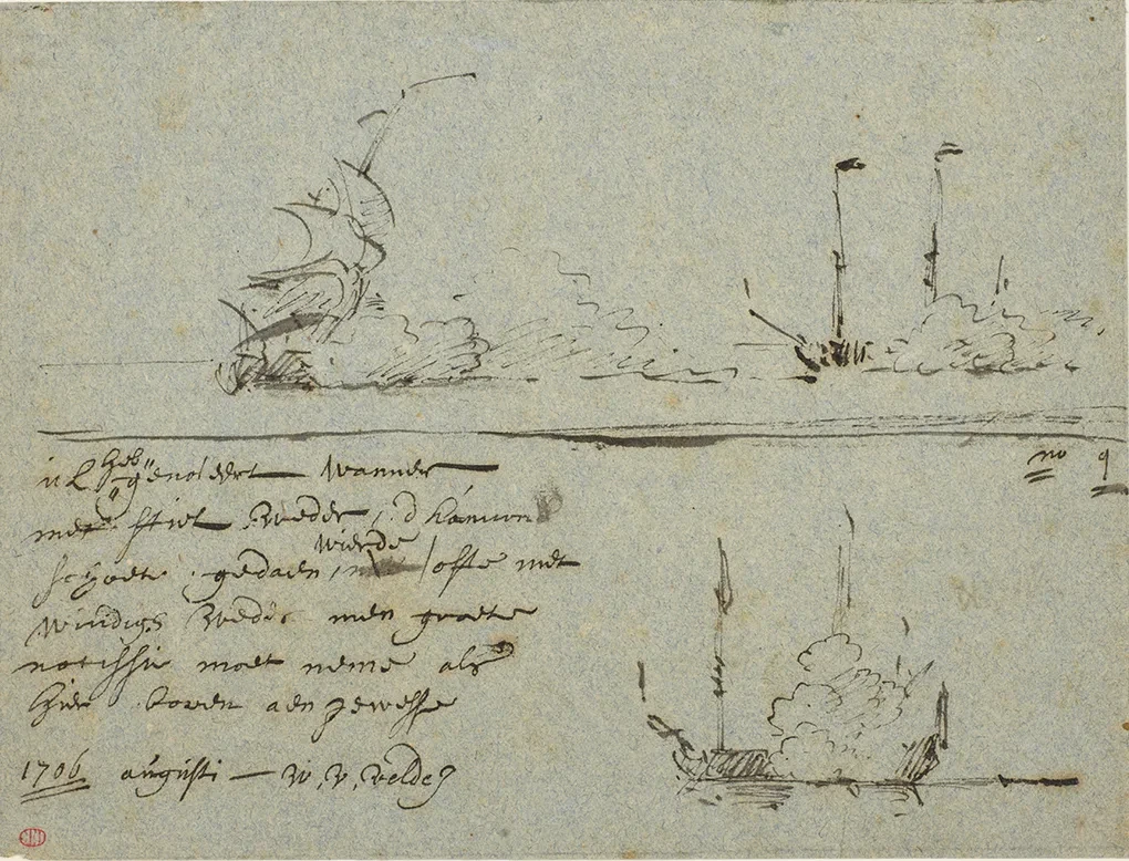
Translated, the text reads, ‘I have noticed that one must be careful to observe whether a gun is fired in calm or windy weather, as is shown above’.
This is just one of several examples of the Van de Veldes using drawing to communicate artistic technique.
“They provide instructions on, for example, how to portray a ship in a stormy sea, or how the bow of a ship casts spray in different weather conditions," Goudie explains. "Other drawings describe the fall of light on an object, or how to create the impression of perspective.”
Goudie adds that it is likely that these instructional drawings were made for assistants and collaborators within the Van de Velde studio.
“The Van de Veldes were highly prolific artists. The fact that some 200 Van de Velde paintings were available at auction around 1690 alone gives you an indication of the sheer output of their studio. This must have been supported by studio assistants, but it’s very hard to know exactly who was involved and in what way,” she says.
Adding colour and context
Not all of the inscriptions are tutorial in nature.
“On some of the ships’ flags for instance there are little annotations about colour; whoever was looking at the drawing would be able to understand what Van de Velde had witnessed at sea,” says Paper Conservation Manager Emmanuelle Largeteau.
“There is also a lot of information about light: a little ‘L’ in the sky would indicate where the light was coming from in the scene. Remember, when Van de Velde was drawing at sea he was using graphite; many of the drawings are later re-worked in the studio with ink to give the impression of light and shadow.”
These notes may help to explain how father and son worked together. As Goudie explains, “There was a clear division of labour in the studio between Van de Velde the Elder and Van de Velde the Younger. The Elder by-and-large specialised in drawings and pen paintings, whereas Van de Velde the Younger specialised in oil paintings. Van de Velde the Elder was a master of detail; Van de Velde the Younger a master of light.”
Some of the inscriptions have nothing to do with art at all. One message, written on the back of a drawing of a ship, includes the note ‘de kies met het eeten’ (toothache with eating). Use the slider to flip between the front and the back.
“Inscriptions like these give us an insight into the Van de Veldes’ lives in England, and the extent to which they integrated into society,” says Goudie. “Almost all of their inscriptions are in Dutch, save for a few exceptions where words have been spelled in a sort of hybrid Dutch-English phonetics. It underlines just how strong the Dutch community was that the Van de Veldes never really needed to master written English.”
A window into the studio
The relationship between the Elder and Younger was just one part of what must have been a busy studio environment.
"Many artists have been associated with the Van de Velde studio, but very few with any kind of concrete evidence," Goudie explains. "That said, it seems very much that it was a family affair. We know for example that Cornelis van de Velde, the son of Van de Velde the Younger, was involved in the studio, and indeed continued it after the Younger's death. Johann van der Hagen, the Younger's son-in-law, was also involved in the studio.
There were also a number of women involved – Van de Velde the Younger’s daughters for example – but sadly we can’t say for sure what their specific roles were."
Just occasionally, these family connections appear to resonate in the drawings themselves.
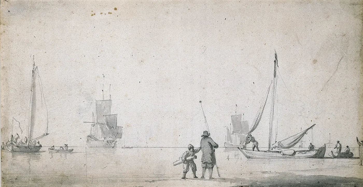
“One drawing I find particularly charming is a study in perspective,” Goudie says. “In the foreground we have this lovely image of a boy, with the horizon line running behind his head. Next to the boy is the number ‘4’, indicating that he’s four foot high – the whole system of perspective in the sketch is using his height as the yardstick. Standing next to him is an older man.
"I like to think of this as a father and son combination. I imagine this being particularly poignant for the Van de Veldes, given the importance of the father-son relationship to the studio.”
Find more stories in this series
Tap the arrows to find out more about the Van de Velde drawings collection
A Sea of Drawings
Why do artists draw, and what can their sketches teach us about their skills and techniques? Take a closer look with the unique Van de Velde drawings collection
The Van de Veldes in Greenwich
Find out about the Dutch artists’ time in the Queen’s House
Paper and materials
What did the Van de Veldes use to create their detailed ship portraits and maritime sketches?
Sketching at sea
Daring, dedication and an eye for detail – how Van de Velde the Elder risked his life to record naval battles as they happened
Artist secrets revealed
Explore how the Van de Veldes used their vast drawings archive to bring their maritime masterpieces to life
The legacy of the Van de Veldes
How the founders of British marine painting inspired generations of artists, including J.M.W. Turner
Our partners
This project has been made possible with support from the Getty Foundation through The Paper Project initiative.