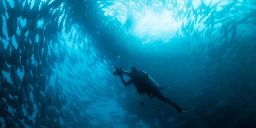
The ocean powers our planet.
It regulates our climate and generates almost half of all the oxygen produced on Earth. It’s home to the most abundant and strangest life in the world.
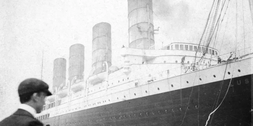
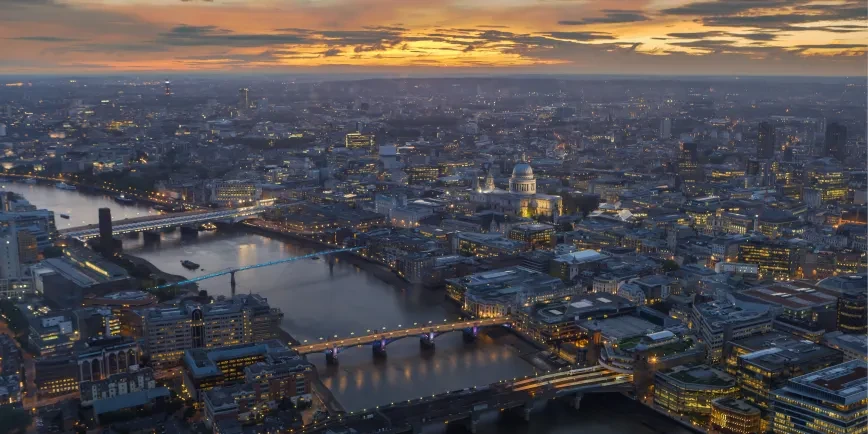
Humans have travelled the ocean for thousands of years, and today more than 80 per cent of all goods are transported by sea.
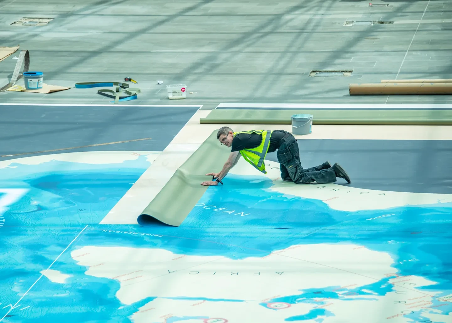
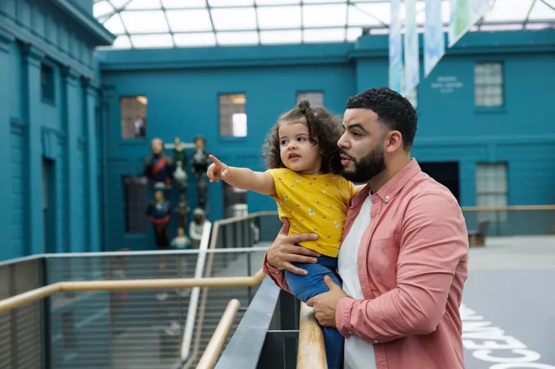
Yet despite all this, it’s easy to ignore the blue bits of our ‘blue planet’. A new display at the National Maritime Museum aims to change that.
'A map of the world according to fish'
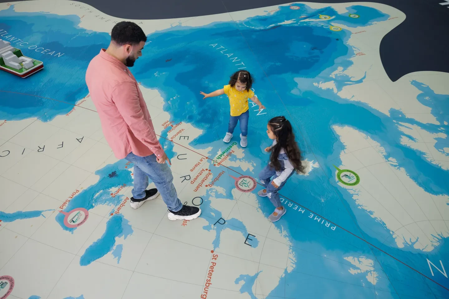
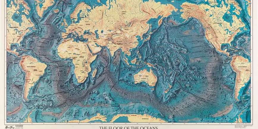
The Ocean Map is a giant, 440m2 floor map that turns our view of the world inside out. While most world maps focus on countries and continents, the Ocean Map is all about water.
At first glance it looks a bit strange: land mass disappears, familiar features break apart and solid ground shifts.
But then, all maps are strange: distorted depictions of our world designed to show what’s helpful to the user or important to the creator.
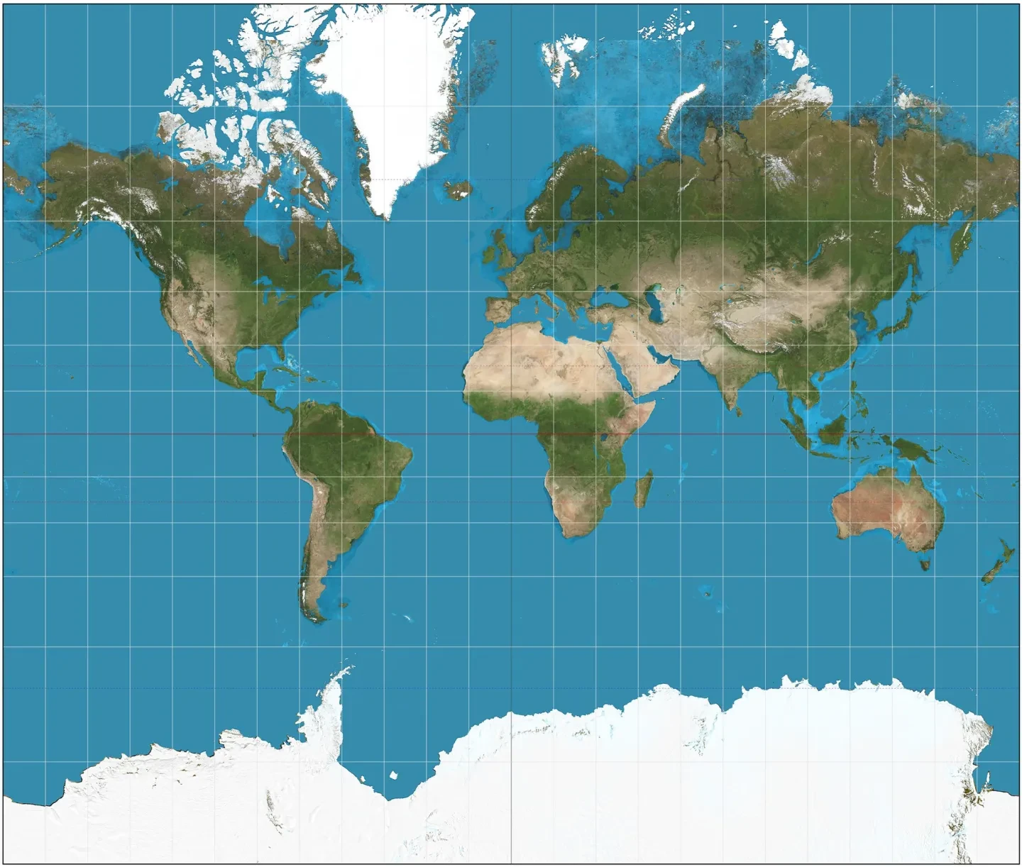
The world map we’re used to seeing in textbooks and on phone screens, known as the ‘Mercator projection’, is just one way of mapping the world. It’s a type of map that prioritises land at the expense of the ocean.
The Ocean Map does the opposite.
Instead of several separate bodies of water, the map shows us that there is in fact one vast ‘world ocean’. This interconnected system is the hidden driver behind all life on Earth.
‘The world is 71 per cent ocean, but you wouldn’t know it from looking at a standard world map,’ says Tim May, Curator of Maps and Mobilities. ‘What’s great about the new Ocean Map is that it encourages us to consider the world from a different perspective, one which reclaims the importance of the ocean on which we all depend.’
How to map the ocean
The Ocean Map is based on a type of map known as the ‘Spilhaus projection’.
In cartography, a projection refers to the way mapmakers represent a round globe on a flat surface.
‘We’re so familiar with the maps we see in school that we start to assume they are the only “true” or “correct” interpretation. We forget that all maps are projections,’ says Laura Boon-Williams, Lloyd’s Register Foundation Senior Curator: Contemporary Maritime.
‘There’s no such thing as a completely accurate flat map,’ adds Aimee Mook, author of The Ocean Map: exploring our watery world. ‘You always distort something.’
The decision of what to distort comes down to what the map is being designed for – which is where Spilhaus comes in.
The Spilhaus projection was devised in the 1940s by the oceanographer and inventor Athelstan Spilhaus. Born in South Africa in 1911, Spilhaus emigrated to the United States in the 1930s and joined the Woods Hole Oceanographic Institution in Massachusetts. He developed the bathythermograph (a device for measuring ocean depth and temperature), established a programme to support marine research, and published works on everything from future cities to mechanical toys.
He also created the world ocean map now known as the Spilhaus projection.
‘The objective was to devise maps which showed the whole world ocean as a connected, single body of water uninterrupted by the edge of the map,’ Spilhaus wrote in 1983. ‘The solution depends on the selection of suitable interruptions – the cuts on the Earth's skin to unfold and flatten it. If no interruptions are to be in the sea, all must lie within the land.’
This slicing and peeling of the world weren’t just casual experiments. Displaying the ocean as a connected system helps us better understand how it works, from the movement of water to the migration of animals.
Visualisation of ocean currents moving around the globe, courtesy of NASA's Scientific Visualization Studio
‘I came across the Spilhaus projection many years ago,’ says Aimee. ‘It was described to me as “a map of the world according to fish”. I don’t know who coined the phrase, but it made so much sense. Fish aren’t thinking, “oh, we need to go around Asia.” It’s just one big ocean to them.’
‘There is this traditional maritime view of seeing the ocean as simply a “highway”, but it isn’t,’ says Laura. ‘The ocean is an enormous interconnected system, and life on land completely relies on it. This ocean-dominant map just helps to challenge our preconceptions.’
Life beneath the waves
If you visit the Ocean Map you don’t just walk on water – you can see what lies beneath as well.
‘The ocean is more than just a flat surface. It’s loud, exciting and diverse, with lots of things going on down there that we do or don’t know about,’ says Aimee.
The Ocean Map helps us to imagine this depth and variety. Up close the map looks scratched and scarred in places, with huge underwater trenches appearing as dark cracks in the Earth’s surface. Islands in the Pacific meanwhile stand out as tiny pinpricks in a vast sea of dark blue.
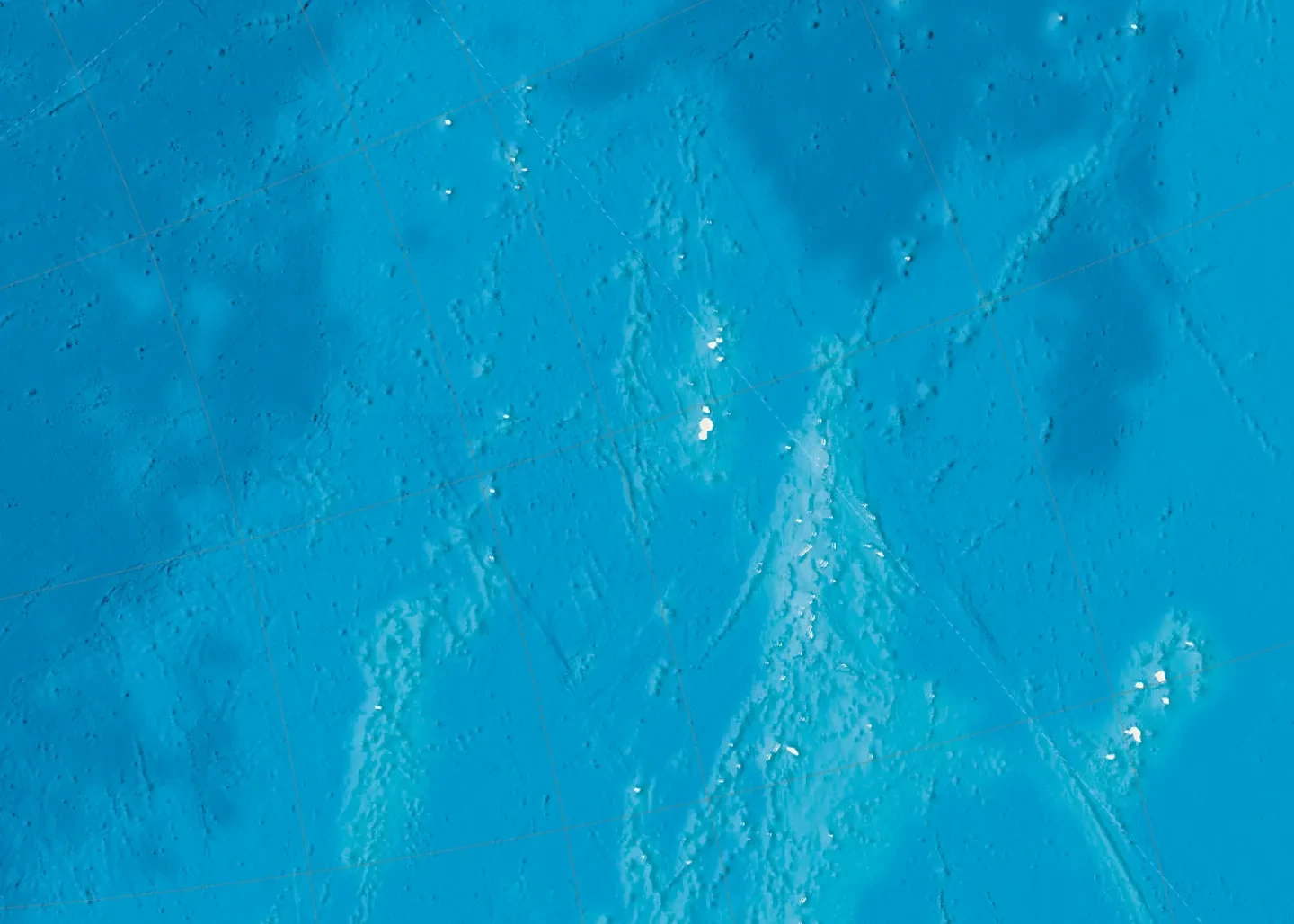
‘What was wonderful to see from one of our test prints was how visible many of the small islands in the Pacific were,’ says Laura. ‘They’re small but you can find them, see where they cluster and appreciate the depth of the water around them – all of which helps to understand why they’re so vulnerable to rises in sea level.’
The Ocean Map also highlights several natural ocean features and habitats, including Australia’s Great Barrier Reef and the Chicxulub impact crater centred off the coast of Mexico (otherwise known as the asteroid that wiped out the dinosaurs).
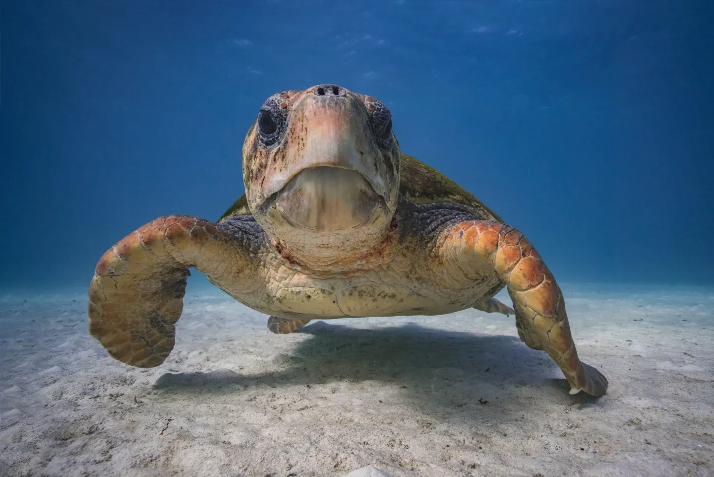
If you look closely, you can even spot the silhouettes of 20 different ocean creatures. From the colossal squid to the wandering albatross, the loggerhead turtle to the hammerhead shark, they represent just a sample of the huge range of life in the ocean.
Human impacts on the ocean
The Ocean Map also hints at some of the ways humans have left their mark on the ocean.
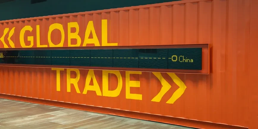
More than 11 billion tonnes of goods are transported by sea each year. The map highlights 80 key ports for container ships around the world, allowing visitors to join the dots and identify the routes that make global trade possible.
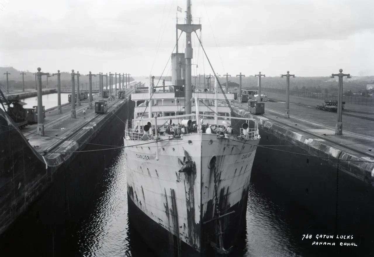
The map labels include the Panama Canal and the Suez Canal, two places where people have quite literally carved ‘connections’ between oceans. The Suez Canal, opened in 1869, is a 120-mile-long human-made channel connecting the Mediterranean and the Red seas. When the container ship Ever Given became stranded in the canal in 2021, Lloyd’s List estimated that the blockage held up $9.6 billion (£7bn) of goods every day.
An ocean generation
Trading networks, marine habitats, planetary processes: a single map can only ever present a tiny fraction of this vast ocean system. What it can do is encourage us to escape our land-centred view of the world.
‘The most obvious thing, and what I hope people take away from this map, is that it’s all one ocean,’ says Aimee. ‘The seas surrounding the British Isles are part of the same ocean that surrounds Fiji, Antarctica or Indonesia.’
‘It might feel a little bit unfamiliar at first, but I think it’s a nice way of opening up a conversation about the ocean,’ adds Laura. ‘What’s fun is that we know that a lot of very young children come to the National Maritime Museum to play on the map. For some, this will be the first world map they’ve ever seen!’
Image
Your guide to our watery world
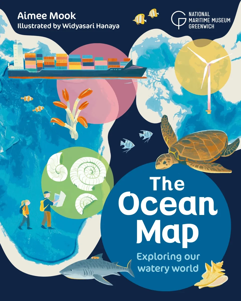
Packed with vibrant illustrations and curious facts, The Ocean Map book by curator Aimee Mook is for explorers who want to dive into our wonderful ocean – and learn how to protect it.
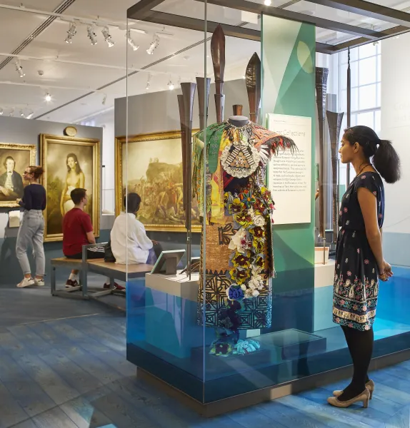
Visit the National Maritime Museum
Read more
Our relationship with the sea is changing. Discover how the ocean impacts us – and we impact the ocean – with the National Maritime Museum.