There are around 40,000 maps in the Royal Museums Greenwich collection.

From seafarers' charts to luxury table globes, weighty atlases to scribbled sheets, it's easy to get lost in this vast repository of cartography.

But help is at hand.

With their new book A is for Atlas, curator Megan Barford has plotted a route through the history of maps and mapping. The book includes some of the most detailed and surprising maps ever created, arranged according to a series of themes from A to Z.

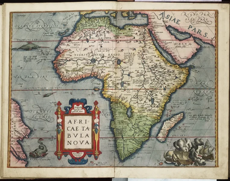
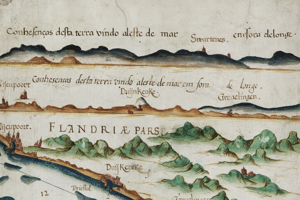
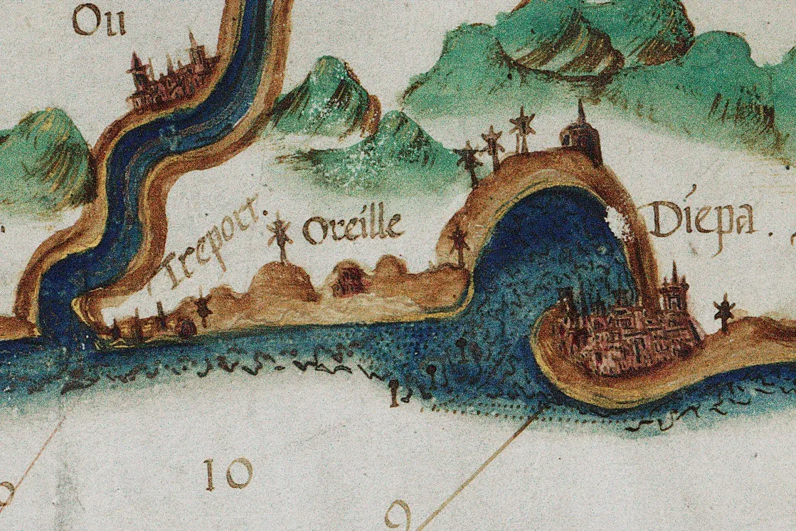
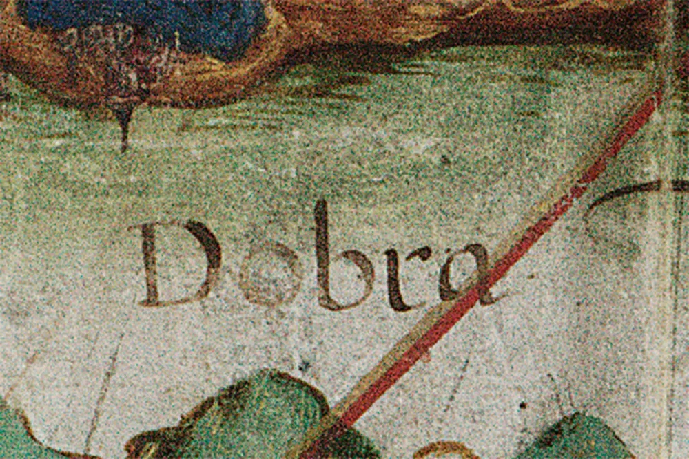
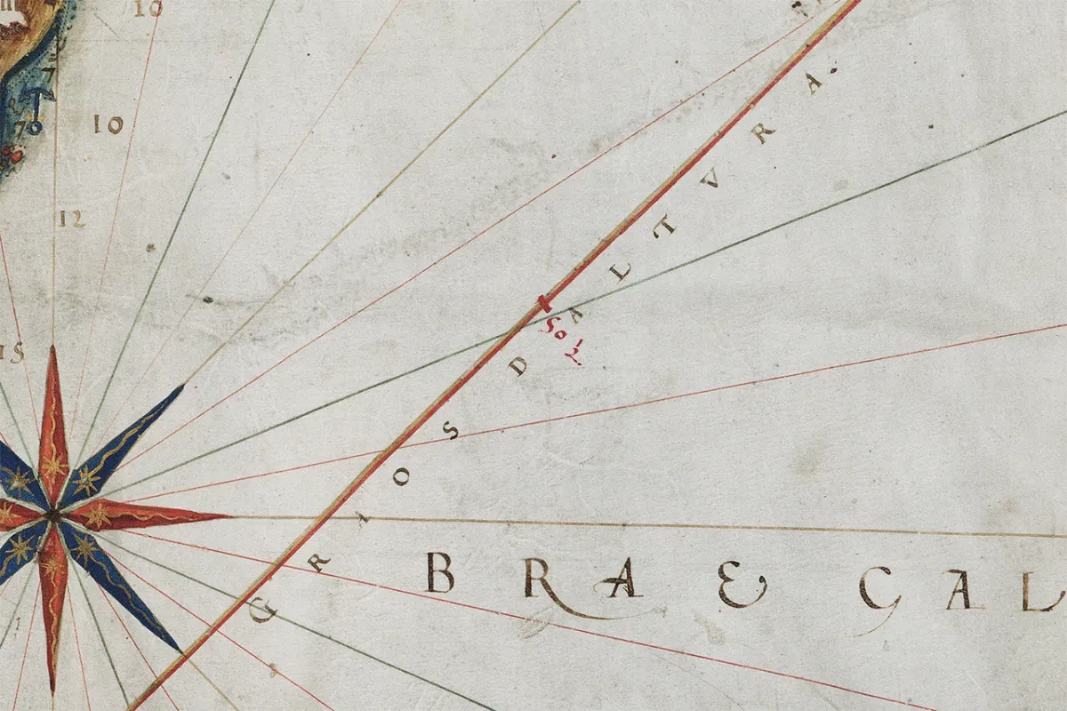
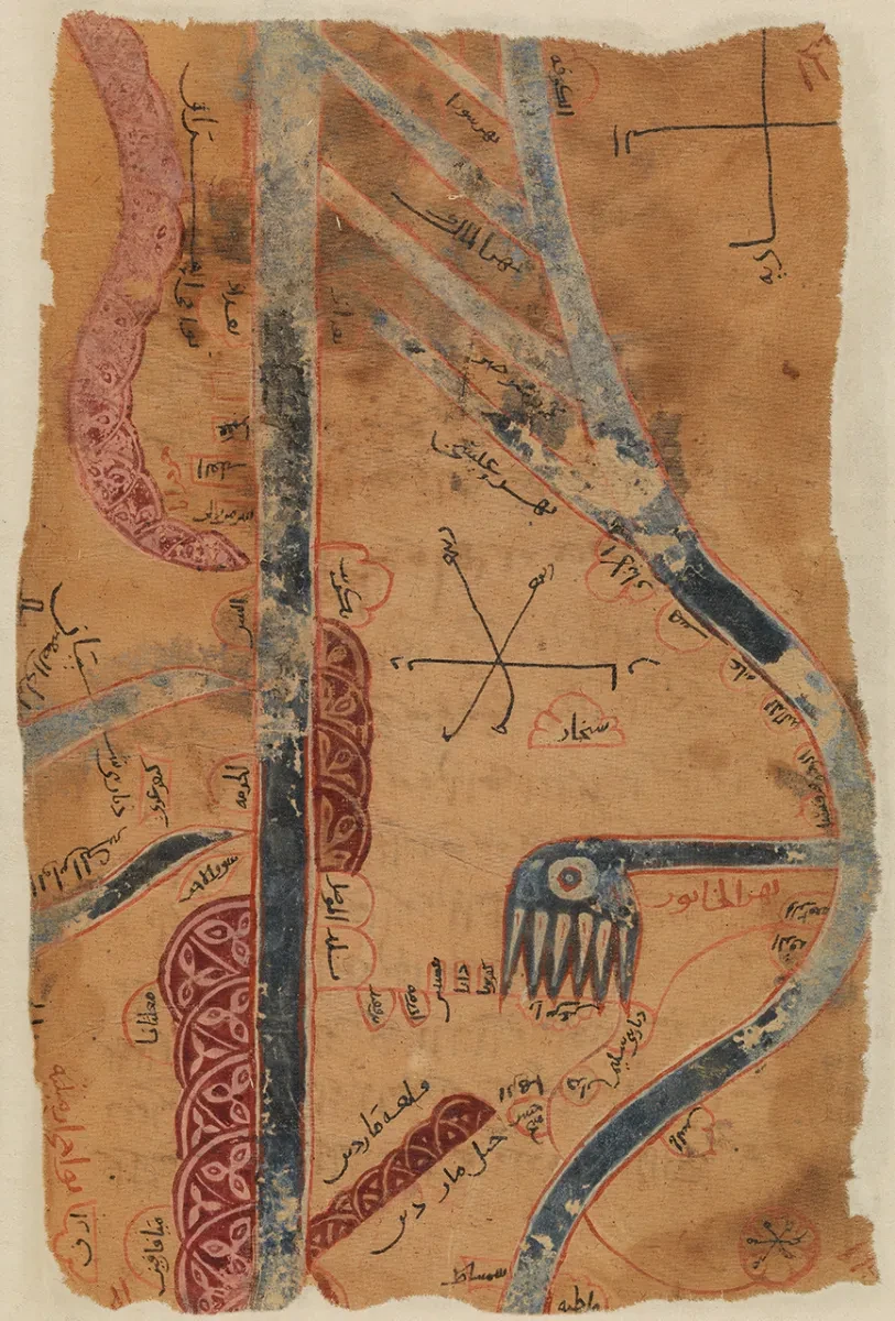
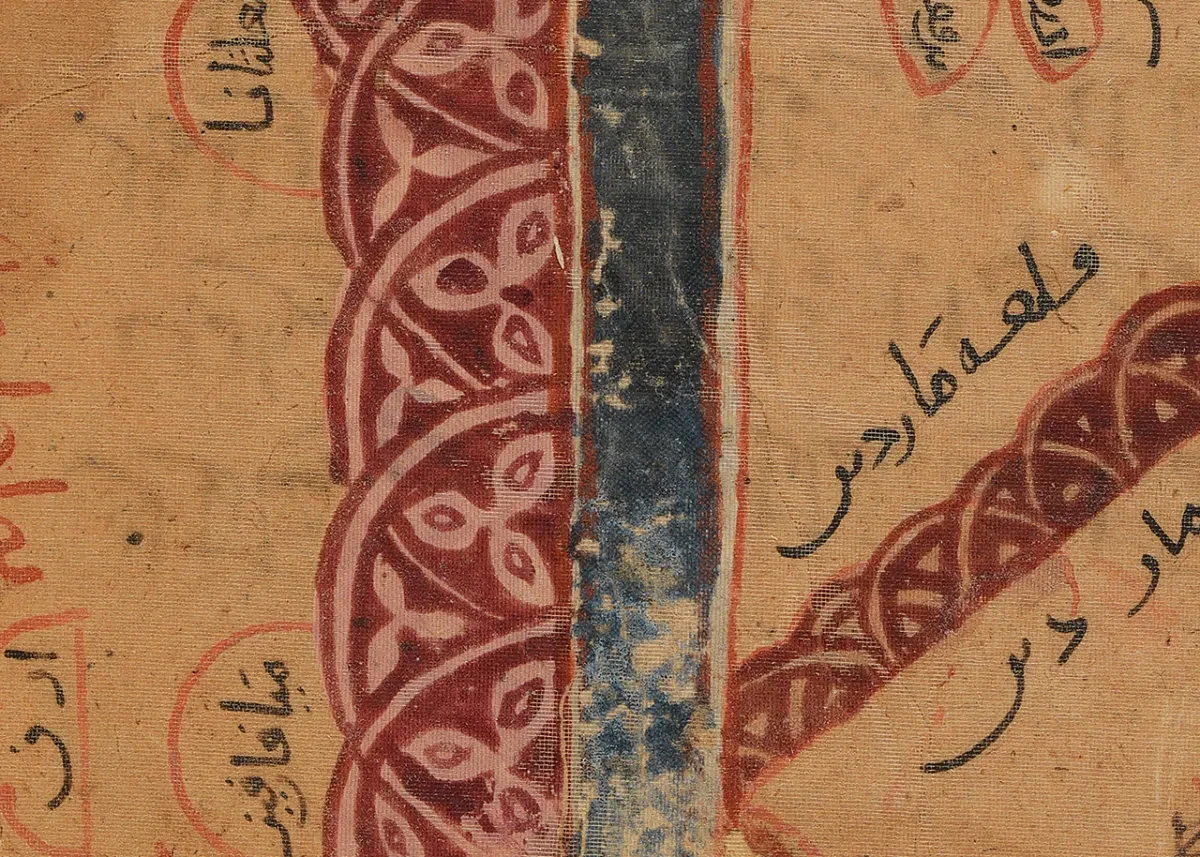
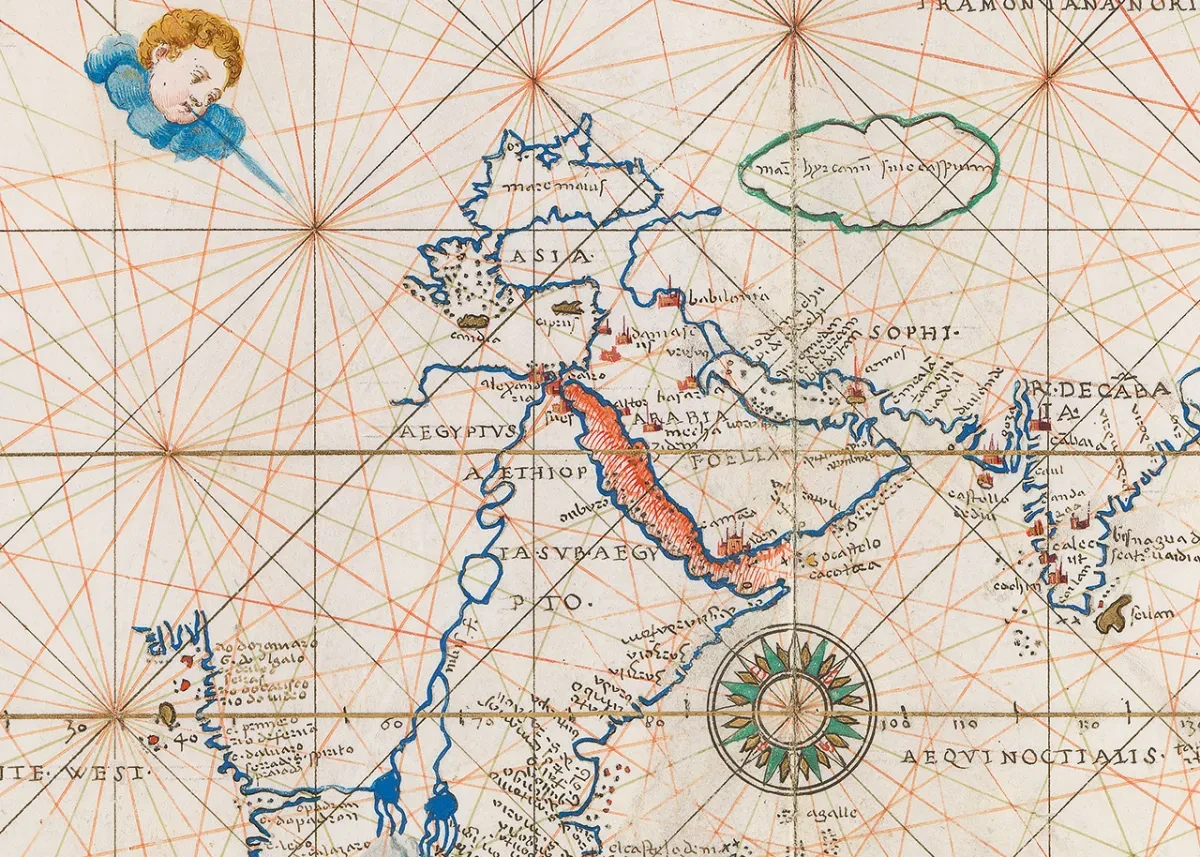
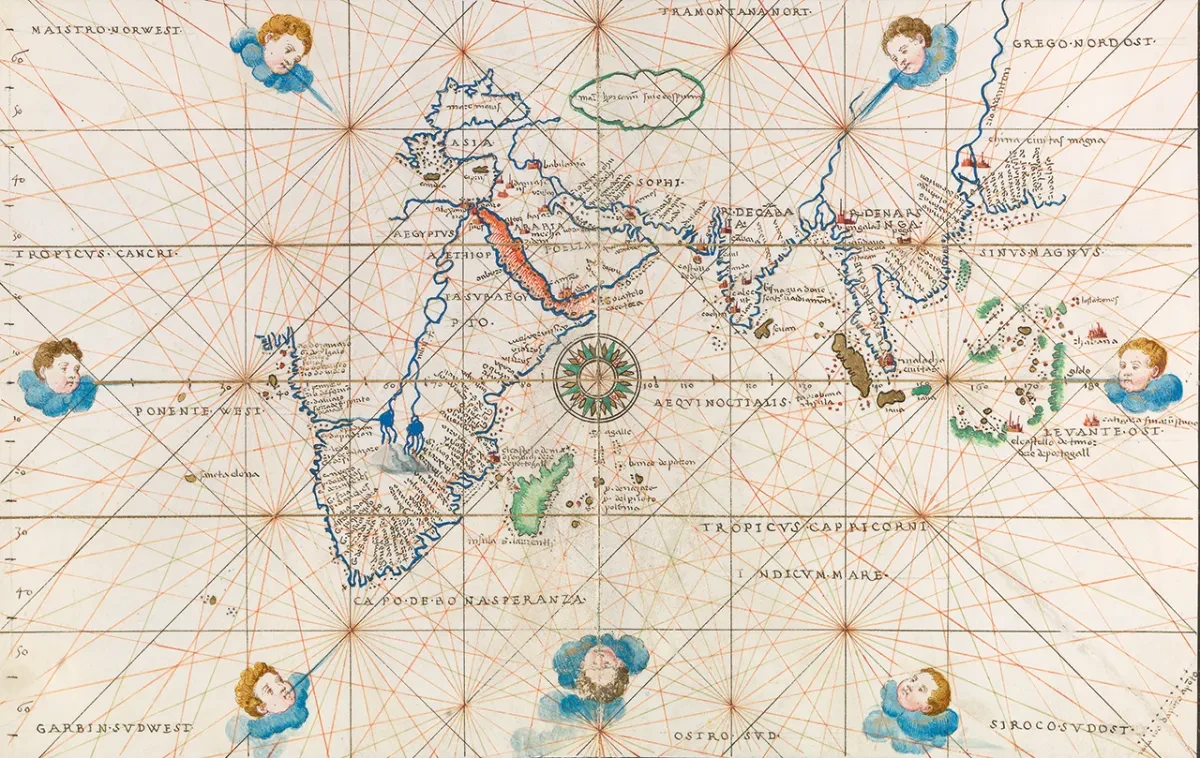
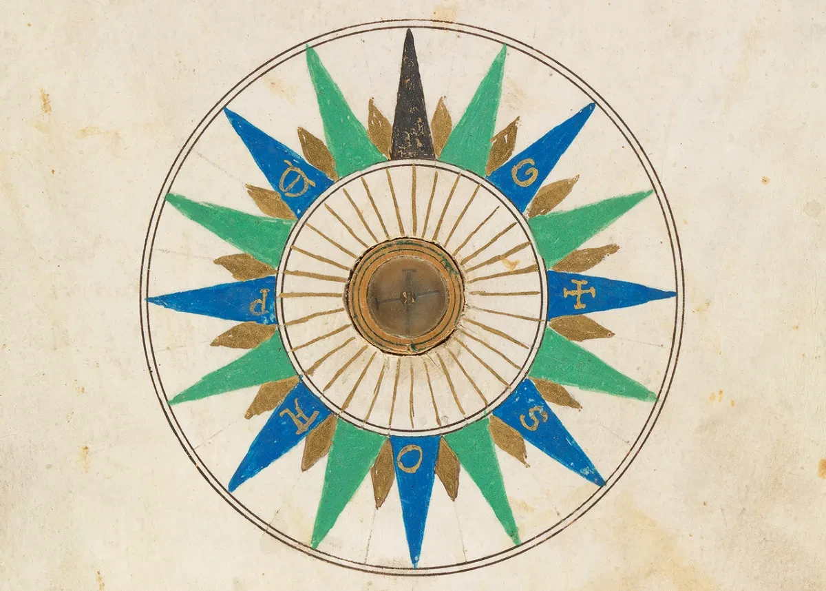
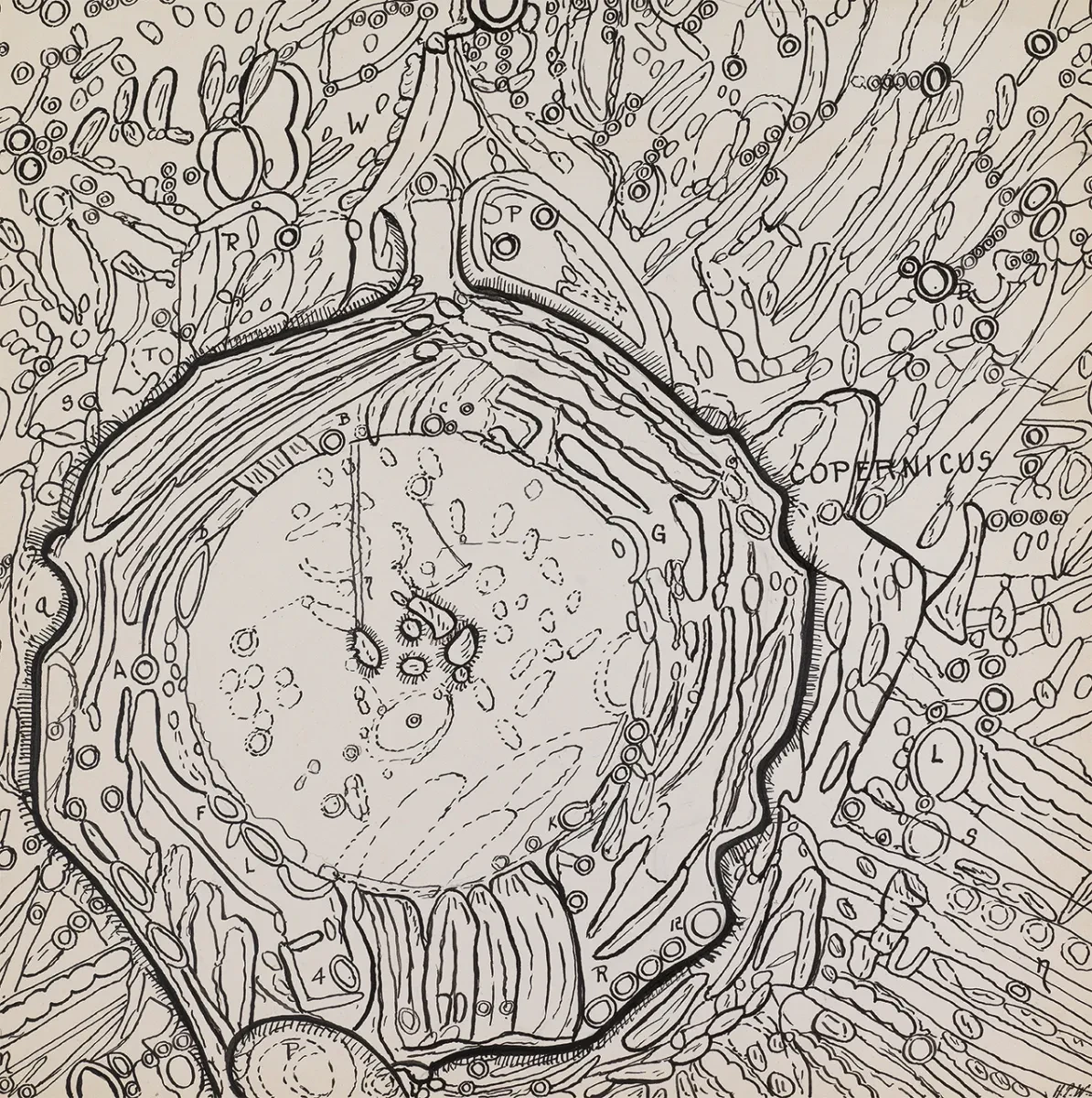
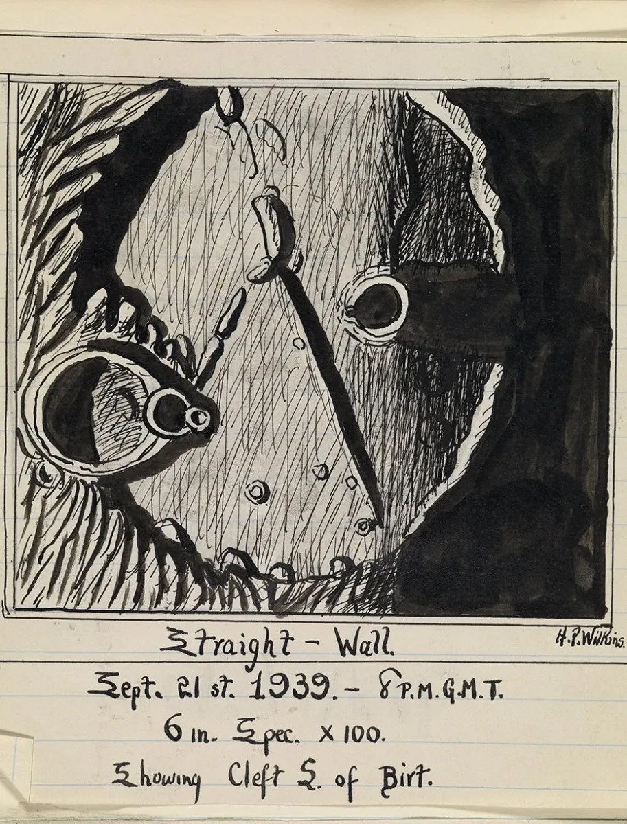
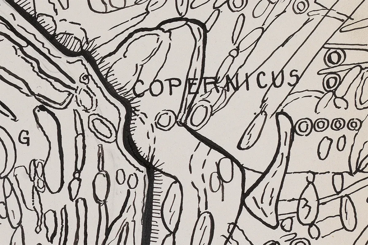
Below, they select four 'manuscript maps' featured in the book, hand-drawn by their creators and meticulously plotted.

Tap the arrows to explore each map, and find out more about A is for Atlas here.

Map of the Channel between Dover and Calais

Made in 1587, attributed to Luis Teixera

Explore this map

Found in translation

This chart, which shows the Channel between Dover and Calais, was copied from a printed atlas at the end of the sixteenth century. 

A Portuguese translation of the fourth sheet of Dutch cartographer and navigator Lucas Janszoon Waghenaer’s Spieghel der Zeevaerdt (1584), it prompts us to think about the complex relationship between manuscript and print.

Click to expand

An image for 'Found in translation'

Language of the sea

Waghenaer’s work, now famous as the first printed sea atlas, drew on his experiences as a mariner and his exposure to Portuguese, Spanish and Italian manuscript navigational aids, including charts. 

He was also influenced by the tools and techniques of northern European seafarers, who tended to rely on textual descriptions of maritime routes. Describing – in charts, text and coastal views – the coasts along the route from the North Sea to the Mediterranean, the atlas was a great success and was reprinted and translated into several languages.

Click to expand

An image for 'Language of the sea'

Safe harbours and deadly coasts

Publishers also came to use it as a model for later sea atlases. Its focus was explicitly navigational, as demonstrated by the fact that the details of harbours are enlarged, while coastlines where vessels would not seek to anchor have been compressed.

Click to expand

An image for 'Safe harbours and deadly coasts'

Dobra e Cales

This particular chart, carefully copied, translates the better known places into Portuguese – ‘Doueren’ (Dover) becomes ‘Dobra’; ‘Diepe’ (Dieppe), ‘Diepa’. Other smaller or less frequented places retain their Dutch names. Winchelsea remains ‘Winkelseij’ and Dunkirk is ‘Duijnkerke’.

Click to expand

An image for 'Dobra e Cales'

Navigating by the stars

At the same time, the map-maker adjusted their version of the chart by adding a latitude scale, the thick red diagonal to the right-hand side. This had been a feature of Portuguese charts since the early sixteenth century, relevant for astronomical methods of navigation less commonly used by northern mariners. For Portuguese users, the printed chart was brought up to date by its reproduction in manuscript.

Click to expand

An image for 'Navigating by the stars'

Mesopotamia, Kitab al Aqualim

Created before 1282 by Abu Ishaq Ibrahim ibn Muhammad al-Farisi al-Istakhri

Explore this map

Mesopotamia, Kitab al Aqualim

This map, and the volume to which it belongs, is part of a textual tradition of geographical manuscripts that lasted for almost a millennium. The work was authored in the rich literary atmosphere of the medieval Islamic world by tenth-century scholar Abu Ishaq Ibrahim ibn Muhammad al-Farisi al-Istakhri.

Al-Istakhri described the different regions ruled over by the Abbasid Caliphate, including details of major cities, regional customs and produce, and tax revenue. He detailed ‘individual pictures [that] show the outlines of each region in the Islamic world, the cities it encompasses and everything that needs to be known about it’.

Click to expand

An image for 'Mesopotamia, Kitab al Aqualim'

Reading the signs

Copies of the original were made over many centuries and distinctive versions have emerged. Different scribes introduced different artistic flourishes and elements to personalise their work.

In this map of Mesopotamia, a historic region that encompassed much of modern-day Iraq, Syria, Kuwait, Iran and Turkey, the mountain ranges – in red – are decorated with floral or geometric patterns.

Click to expand

An image for 'Reading the signs'

Rivers of the world

Two rivers are shown in blue: the curved line to the right represents the Tigris; the straight line to the left the Euphrates.

This particular volume is one of the oldest of 59 known copies in the world today, with a handwritten statement of ownership inside which dates it to before 1282.

Click to expand

An image for 'Rivers of the world'

Map of the Indian Ocean

Made in Venice in 1555 by cartographer Battista Agnese

Explore this map

Follow the lines

Made in Venice in 1555 by prolific manuscript cartographer Battista Agnese (around 1500–64), this ornate map of the Indian Ocean turns once practical features of early navigational charts into sumptuous decoration.

The criss-crossing network of lines, known as rhumb lines, are useful for establishing compass bearings and coloured for easy interpretation at sea.

Here, they are an ornamental nod to the navigational practices that had brought such wealth to the Venetian Republic.

Click to expand

An image for 'Follow the lines'

The maker's mark

There are 95 known copies of Agnese manuscript volumes in the world today; such an abundance of examples has allowed historians to understand how his work changed over time, incorporating newly published information and the latest geographical knowledge.

Different handwriting and finishes on the various manuscripts, as well as the sheer number of volumes produced, suggest that they were made in a workshop. Not much more is known, as the volumes that bear Agnese’s name or are made in this distinctive style are the only evidence we have of him or his workshop.

Click to expand

An image for 'The maker's mark'

Find your way

Clearly made for a wealthy client, the volume’s original binding also features a practical tool turned into luxury item: into the backboard is set a small, functional compass – a finely crafted, playful curiosity augmenting the work.

Click to expand

An image for 'Find your way'

Map of the Moon

Created by Hugh Percy Wilkins, about 1945

Explore the map

Navigating the Moon's surface

In 1946, amateur astronomer Hugh Percy Wilkins (1896–1960) produced the most detailed map of the Moon published up until that point.

Drawn at 300 inches diameter, it was printed in reduced form at 100 inches (2.54m). This manuscript of the crater Copernicus was just one part of the work of drawing and compiling that went into making Wilkins’ map of the entire visible lunar surface.

Click to expand

An image for 'Navigating the Moon's surface'

Drawing by hand

As Director of the British Astronomical Association’s Lunar Section, Wilkins developed an international network of correspondents, visited major observatories and worked with his own telescope from his garden in Bexleyheath, south London. He made detailed drawings of light and shadow as they changed on the Moon’s surface in order, eventually, to determine the shape of a particular feature and represent it in outline as a crater, peak, or valley.

Click to expand

An image for 'Drawing by hand'

Detail and dedication

As Wilkins described, ‘much of the finest detail, the most difficult to depict, but by far the most fascinating, vanishes before one’s eyes, dying, so to speak, even while it is born.’ 

Compiling his own and others’ observations at home by hand, Wilkins then checked it all with further time at his telescope. His Map of the Moon was reproduced photolithographically for publication, a process that ensured the distinctive style of his drawing was retained in the finished map.

Click to expand

An image for 'Detail and dedication'

Displaying the Wilkins Moon Map

In 2019 all 25 panels of Wilkins' map were combined in order to create an entire view of the Moon. Watch the video to see more details from the work.

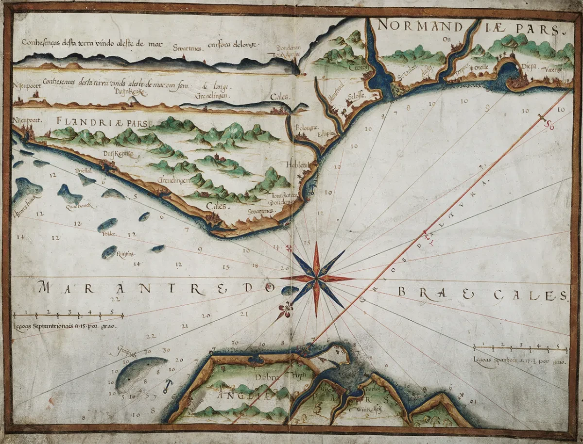
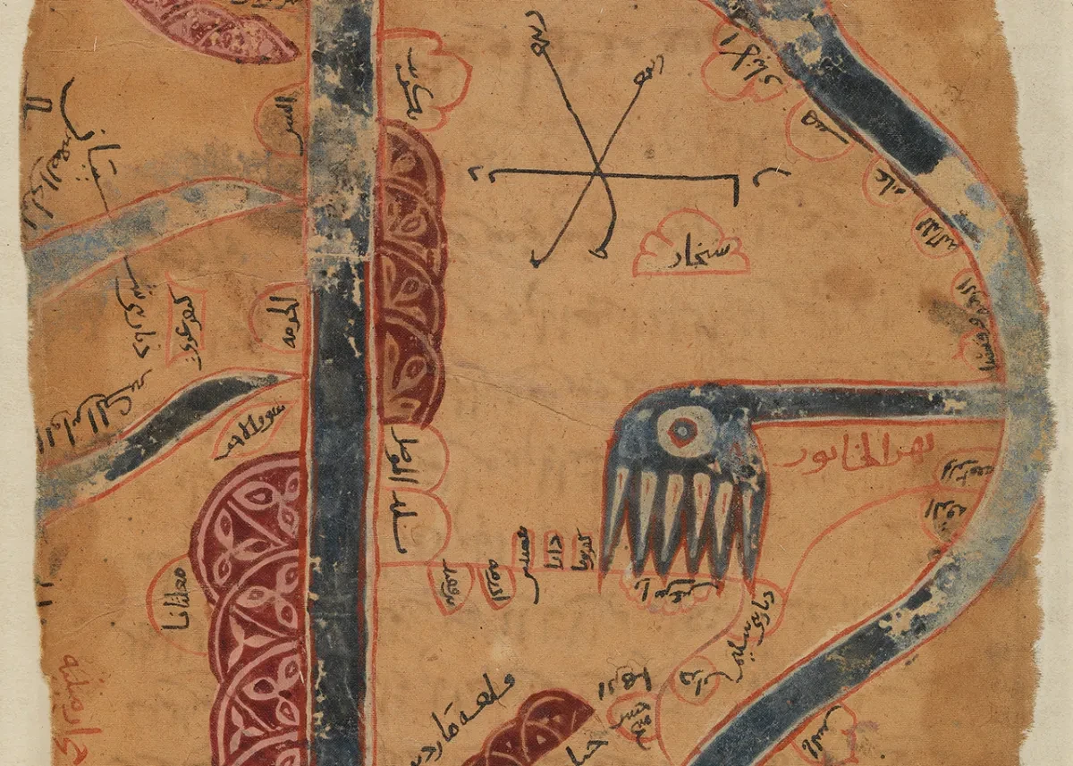
The history of manuscript maps

Maps, charts and globes drawn by hand are often peculiarly compelling.

Medieval works sit within a purely manuscript tradition, in which documents would be copied and recopied by hand, sometimes over hundreds of years.

When, particularly from the sixteenth century onwards, printed maps began to circulate more widely, far from replacing manuscript traditions, they existed alongside them.

Prints were worked up from manuscripts; manuscripts were copied from prints. Sometimes artists attempted to make one form look like the other; sometimes maps contain both printed and manuscript elements. And whether the result of pen or pencil marks of a draft in construction, or the fine illuminated work of a skilled miniaturist, each one is unique.