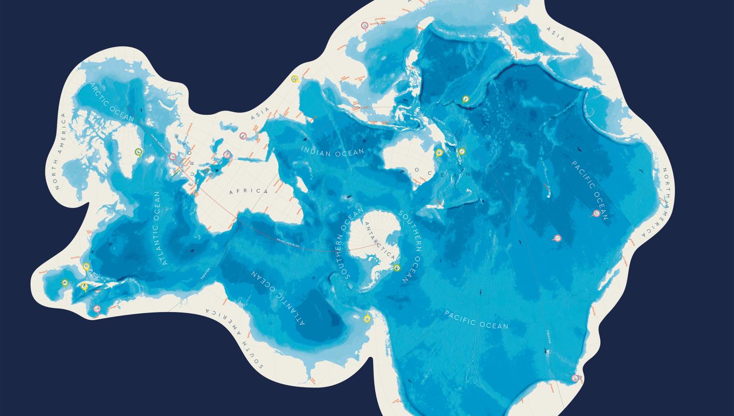
This map turns your view of the world inside out
Watch
Benjamin Lawler, aged 8, and his brother Joshua, 10, are just beginning to discover the myriad wonders of the cosmos. Yet despite their youth, they have already demonstrated remarkable skill. Tap the arrows for more great videos.
This content is hosted by a third party
Please allow all cookies to watch the video.
Watch
Daring, dedication and an eye for detail – see how the artist Willem Van de Velde the Elder risked his life to record naval battles as they happened.
This content is hosted by a third party
Please allow all cookies to watch the video.
Watch
Curator Claire Warrior and polar explorer Iain Rudkin warm up with a relic from our polar past. How is polar exploration changing today?
This content is hosted by a third party
Please allow all cookies to watch the video.
Watch
Dancer, educator, heavy metal fan and astrophotographer: go behind the lens with Monika Deviat, winner of the Aurorae category in Astronomy Photographer of the Year 2023
This content is hosted by a third party
Please allow all cookies to watch the video.
Watch
With its array of colours, striking design and text, it’s hard not to be taken in by this vibrant tapestry. Feeling Blue is a brand-new commission from Royal Museums Greenwich, created by multidisciplinary artist Alberta Whittle and Dovecot Studios in Edinburgh.
This content is hosted by a third party
Please allow all cookies to watch the video.
Watch
See how astronomy photographer Andrea Vanoni captured his remarkable 'mosaic' image of the Moon, part of Astronomy Photographer of the Year 2022.
This content is hosted by a third party
Please allow all cookies to watch the video.
Watch
From perilous refugee crossings to black history and identity, explore the different meanings contained in artist Kehinde Wiley's Ship of Fools.
This content is hosted by a third party
Please allow all cookies to watch the video.
Maritime history
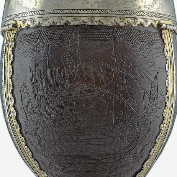
The pirate hunter's cup
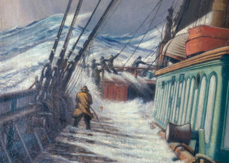
The Shipping Forecast
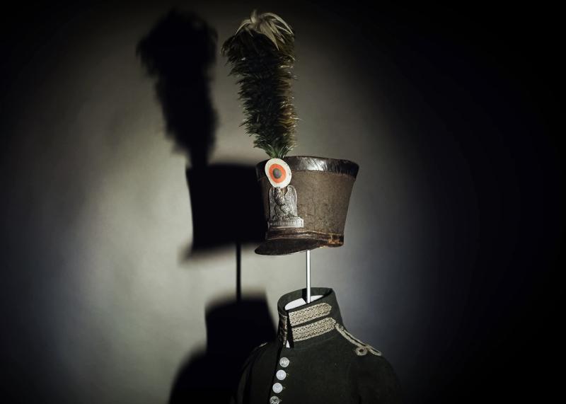
Master of disguise: how a Navy sailor escaped a Napoleonic prison
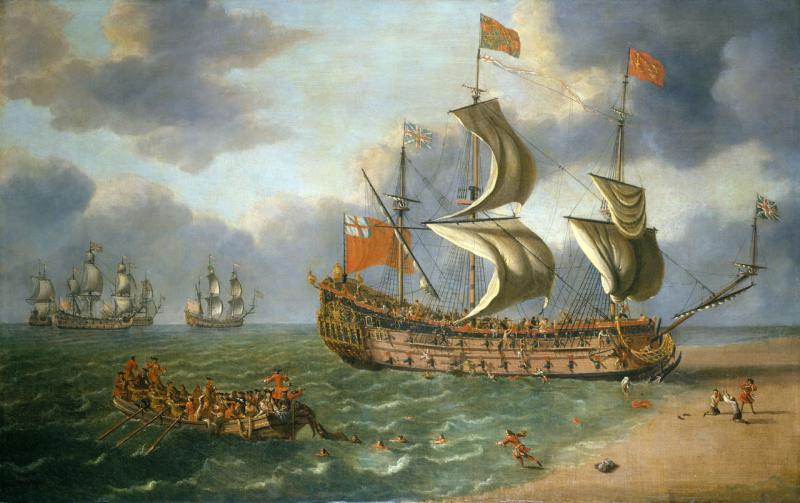
What can shipwrecks tell us?
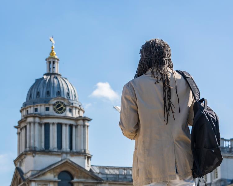
Greenwich walking tours: enslavement and abolition
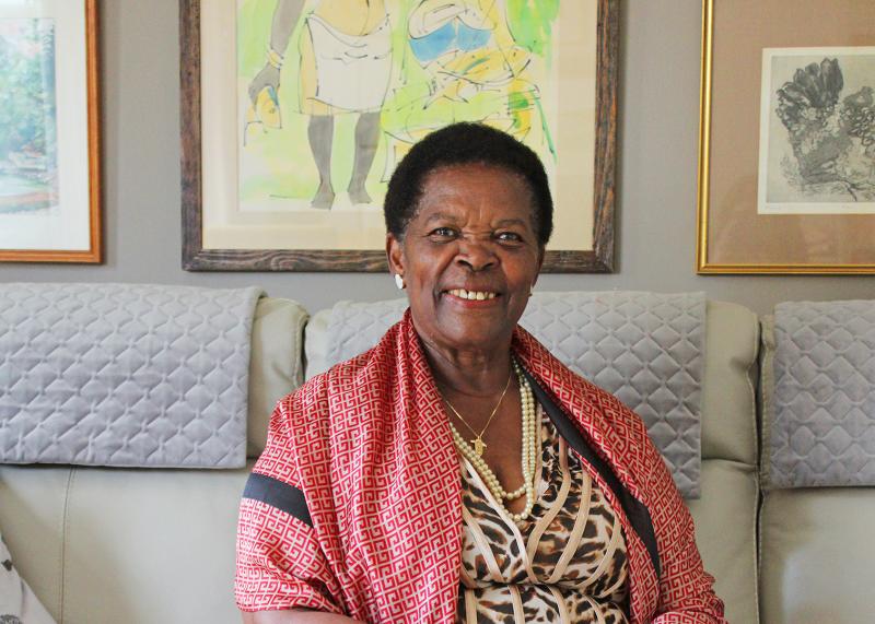
Windrush histories: memories of moving to the UK
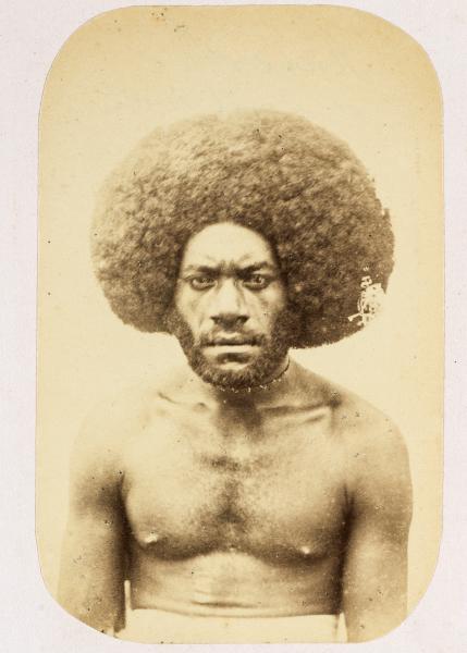
Putting names to faces in the Challenger Expedition archives
Researching queer histories: a fresh look at 'female sailors'
The ship that never was
Knots: measuring speed at sea
The beautiful detail of hand-drawn maps
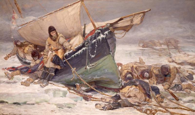
What happened to the crew of Erebus and Terror?
Space and astronomy
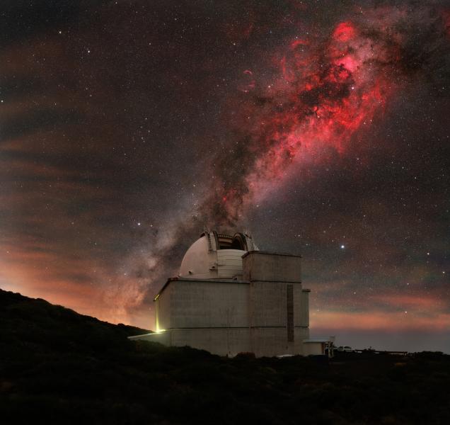
Space and astronomy highlights in 2025
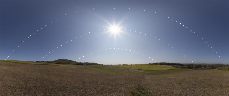
The Sun and the solstice
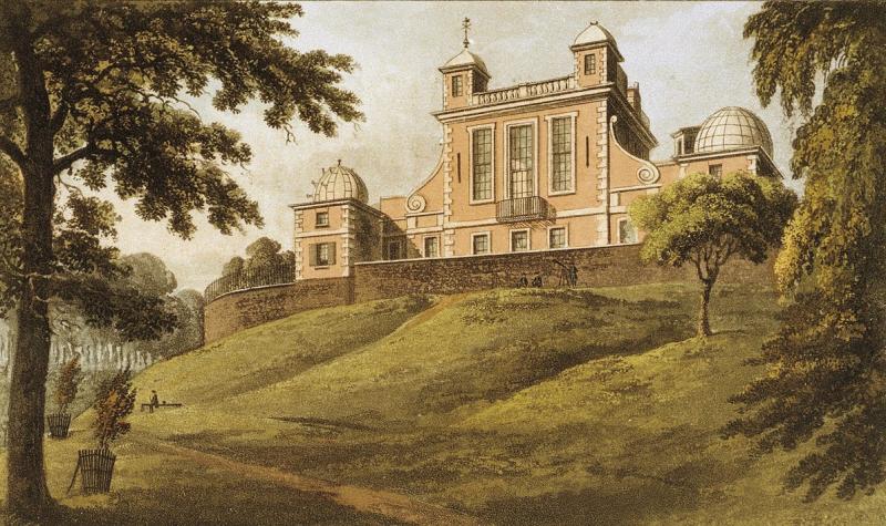
Astronomers and the anarchist bomber
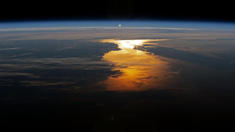
How will the Universe end?
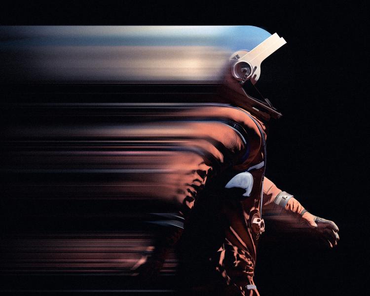
The new space race: a high-stakes competition of politics and power
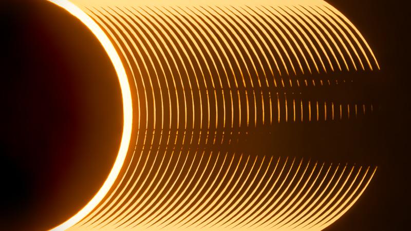
Beads of sunlight: photographing an annular solar eclipse
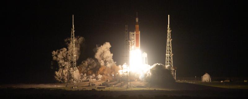
Artemis Programme: what you need to know about NASA’s Moon missions
Jupiter Icy Moons Explorer (JUICE) Mission: All you need to know
Finding community through astrophotography
Guide to meteor showers
History of the Great Equatorial Telescope
How could humans live on Mars?
Art and culture
The story behind... The Keeper of All The Secrets

Reframing Black history: Joseph Ijoyemi and the Atlantic Worlds gallery
Zeenat Mahal: the exiled queen
Beneath the blue: Alberta Whittle on the making of Feeling Blue
The Solebay Tapestry
A history of naval portraiture in six artworks
A Sea of Drawings: the art of the Van de Veldes
Unfolding the past: Elgin Cleckley and the Atlantic Worlds gallery
Women artists in the Queen's House
Reunited at last
Knotted histories
Time
The surprising history of the Greenwich Time Lady
What exactly is Greenwich Mean Time?
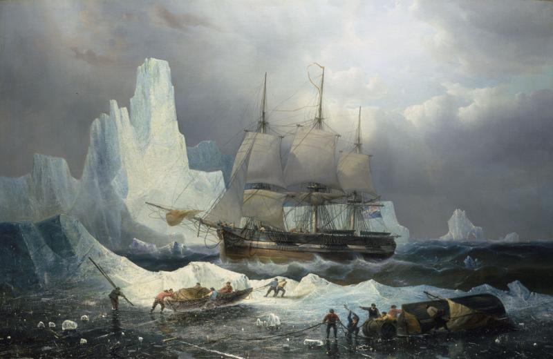
The lost chronometer
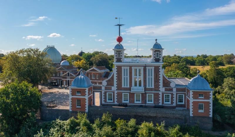
The BBC pips: the Royal Observatory and the Greenwich Time Service
Why 12 months in a year, seven days in a week or 60 minutes in an hour?
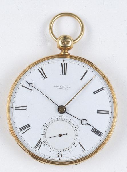
Time before Greenwich Mean Time: the confusing case of the traveller's watch
The ocean
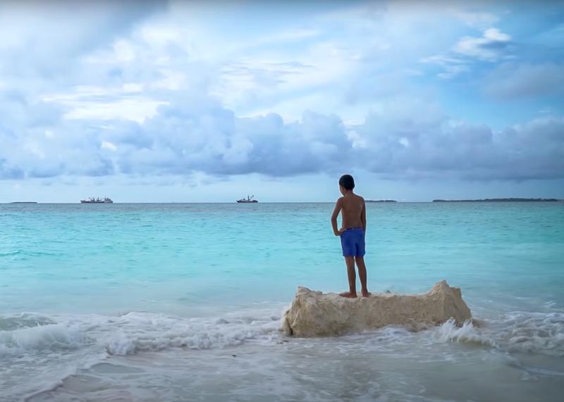
The peoples of the Pacific: on the 'front line' of climate change
Pollution in the River Thames: a history
Ice cores and climate change
Making Waves
HMS Challenger: a trailblazer for modern ocean science

Who owns the ocean?
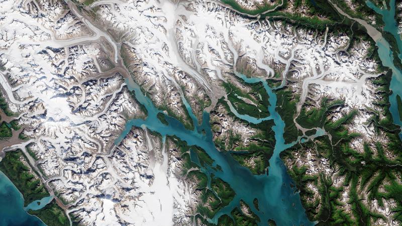
Why satellites are critical to fighting climate change
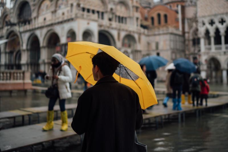
Is Venice flooding getting worse?
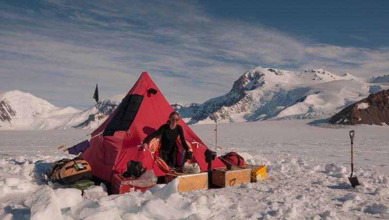
What's it like to camp in Antarctica?
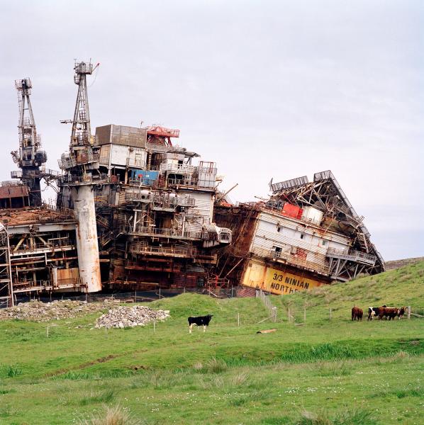
The end of an oil rig's life
Protecting human rights in the fishing industry
In photos: life at sea during COVID-19
Royal history
History of the Queen's House
Greenwich Palace and the Tudors
Mapping the Theatre of the Stuarts
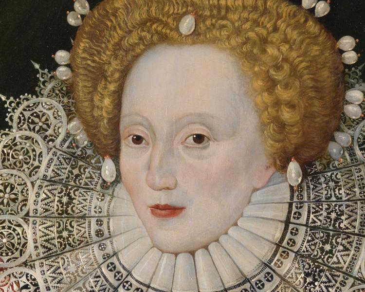
Royal portraits in Royal Museums Greenwich’s collection
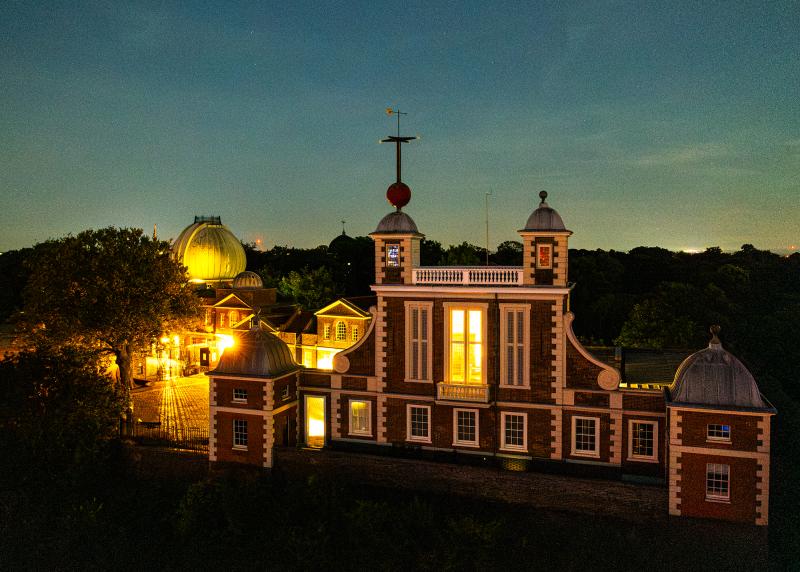
Founding of the Royal Observatory
